01
GLO Studio
Brand / Digital
About
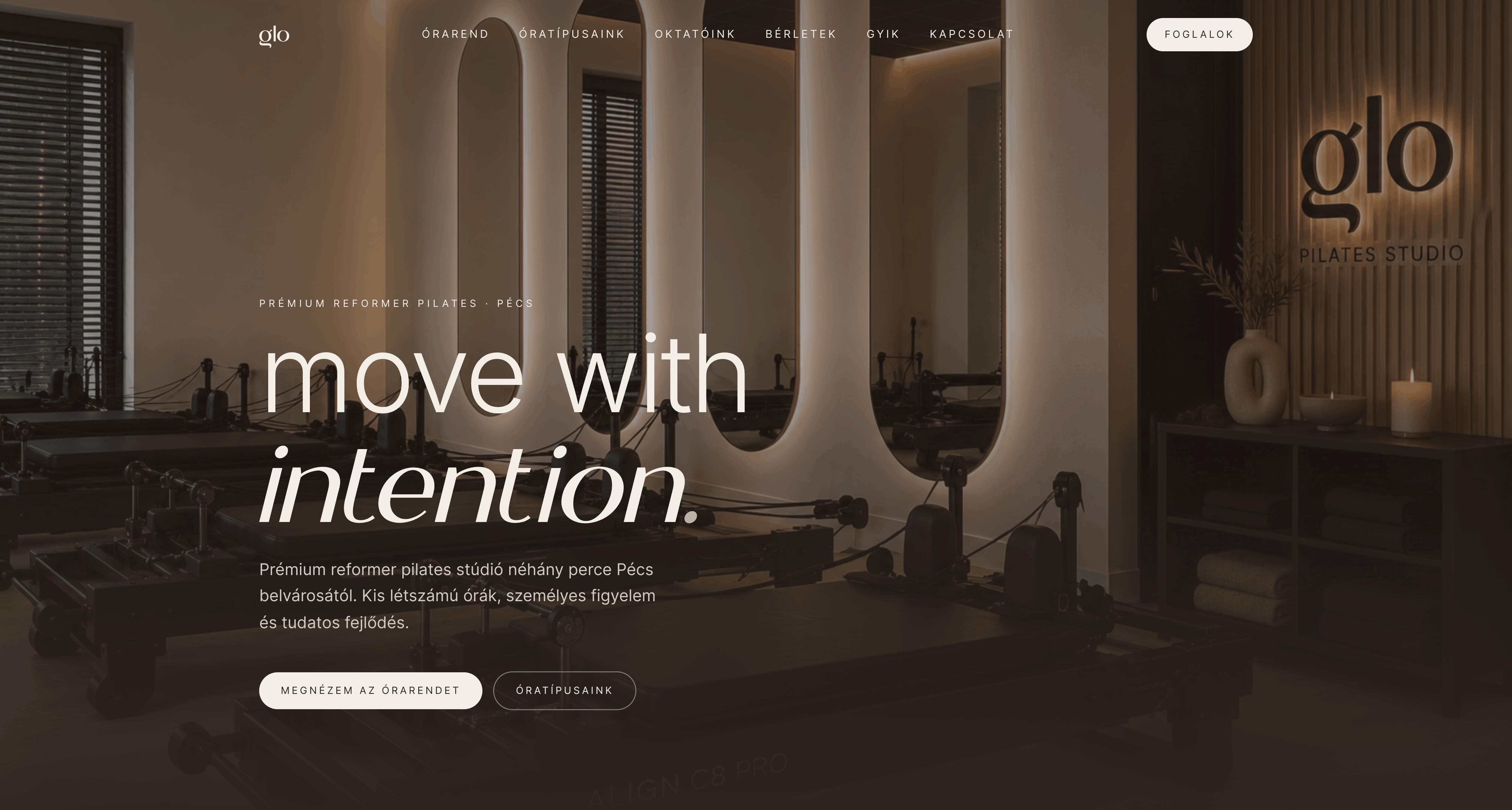
A visual identity built around a very simple idea: keep it clean, memorable and leave enough room for the work itself to stand out.
The direction deliberately avoids the usual over-designed studio aesthetic. Strong typography, a restrained visual system and a name that can carry the brand without needing much decoration around it.
What I did
I worked on the brand direction, typography and overall visual language, with a focus on creating something simple enough to work consistently across digital applications.
- Brand direction
- Visual identity
- Typography